
Author branding: Put a tag on it
/Give yourself a royal branding:The author branding worksheet, part 3
In this week’s post we will focus on the three the remaining elements of my author/personal branding worksheet, including:
TAGLINE MARKS COLOR PALETTE
(If you’ve missed the earlier posts, click on part 1 & part 2.)
These three elements are much easier to develop once you have completed the earlier sections that give a full understanding of your audience, your brand, its basis and driver, your vision and mission. Your positioning statement helps clarify exactly what your audience needs to know.
 These elements also call into play one of the basic rules of communication, and particularly electronic communication – the three second rule. You’ve heard of this rule in regard to candy dropped on the floor (is it still safe to eat?) and most likely in basketball (a lane violation), but it also applies to websites, advertising and any visual communication – like book covers. The rule is, you have three seconds to capture a person’s attention. Either it is visually compelling enough to get readers to stay, or they bounce off to something else: Click to another site, pick up another book, turn the page, goodbye.
Many things are constantly competing for a person’s attention these days. If you can’t grab them fast you’ve lost them. That’s why good headlines and strong graphic design are critical to your brand.
TAGLINE
Everyone does not need a tagline. Primarily they are intended for advertising, but businesses do use them as a hook on websites and signage and in numerous other ways. The main thing with a tagline is to use it consistently and do not waver. Wherever you used it make sure the words, capitalization and punctuation are exactly the same. Make sure it is clearly readable. And make sure it is unique and appropriate (which means you’ll need to do some searches to make sure your brilliant idea has not already been used and trademarked by someone else.)
Many people think writing a tagline is easy, and there certainly have been some classic tags that resulted from a sudden bolt of brilliance. But most of the time a good tagline requires creative thought about all the brand elements, focused brainstorming, and trial and error.
A great tag line is memorable, enlightens people about your business, and differentiates your company and product from competitors. Generally, a good tag line is a short, catchy phrase with an interesting and positive message delivered in 3-6 words.
Taglines are used in three ways: To highlight your brand driver or unique selling proposition, to introduce and showcase your brand, or to capture your positioning against your competitors.
There are five styles of taglines:
- Strong claim
- Showcase benefits
- Showcase company
- Question audience
- Reveal customer emotions
For an author or personal brand, you are showcasing yourself and your values, so the third option may be the best choice, but I would not rule any of them out. Brainstorming should not be constrained.
Start by looking at the websites of other authors or professionals you admire. What is your first impression? Do they use a tagline? How is it used? What words do they use to describe themselves? Think about those words, borrow the ones you like, and list others you can think of that describe what you do.
Next, think about your audience and try to answer this question: Why should they be interested in you and what you do? Answer in as many ways as you can. Consider your particular strengths, your style or approach. And think about what makes you different from others who do what you do.
For me, I thought about my work in historical fiction, my focus on Irish history because of my own passion for it, and my decision to write it in terms of an adventure, with less detail than most historical fiction authors use, and with a faster pace. And, I decided to write my tagline as a call to action. The result?
Embark on an adventure in Irish history
It may not be the world’s best tagline, but it is appropriate for me and it does tend to snag people in when they read it at my book festival booths. Especially if they are Irish or traveling to Ireland.
Do some brainstorming by yourself or with someone else who knows you well. When you have a few options you like, test them on some friends or readers via email, Facebook or in person. See which option resonates the most, and then make it work for you everywhere: Your website, business cards, postcards, posters, one-sheet and wherever else it makes sense for you.
MARKS
A mark is that single graphic that stands for you, and would represent you when you cannot actually be present. For an author, in most cases your mark would be your name, and you might choose a particular type face to use consistently. You might be tempted to choose some of the more graphic typefaces that suggest your genre, like Edwardian Script for historical fiction, or Thriller for thrillers or mysteries. Resist temptation! You will be far better served choosing something that is clean and professional looking. If you decide to write in different genres you will have something that is effective across the board.
If you work with a graphic designer for your book covers (highly recommended), your designer can help you find a typeface that could work well on your covers and be repeated in all of your promotional materials. Once you’ve selected a typeface, stick with it even if you are bored and tempted to try something new. Your signature typeface becomes a core part of your visual brand.
If you will be self publishing, you may need an identity – a logo – that can be used for your book imprint. Again, the designer who does your covers can help ensure everything for your brand works together and can be used consistently. If you design your own there are a few things to remember.
- Always keep your audience in mind. It is easy to get caught up in something you think looks cool, but you may be too close to the process. The graphic you like may not resonate or even make sense to your audience. As with the tagline, be open to feedback.
- A logo should be simple, clean and strong enough to hold up equally as well whether you use it on the side of a city bus or the back of a ladybug. Don’t get too detailed with fine lines and shades that might not hold up. It’s a good idea to design first in black on white. Once that works you can think about colors. Print it in various sizes to see how well it reproduces. You may be sending it out to print media, and they are typically in a deadline rush in which your mark is not their priority. They can make a mess of even the best logos. A strong and simple mark will help you ensure consistency and protect your brand.
- You will need multiple file types (such as jpg, eps, tiff) and multiple sizes to send to the various places you’ll use this logo, so understand what they are and how each is used.
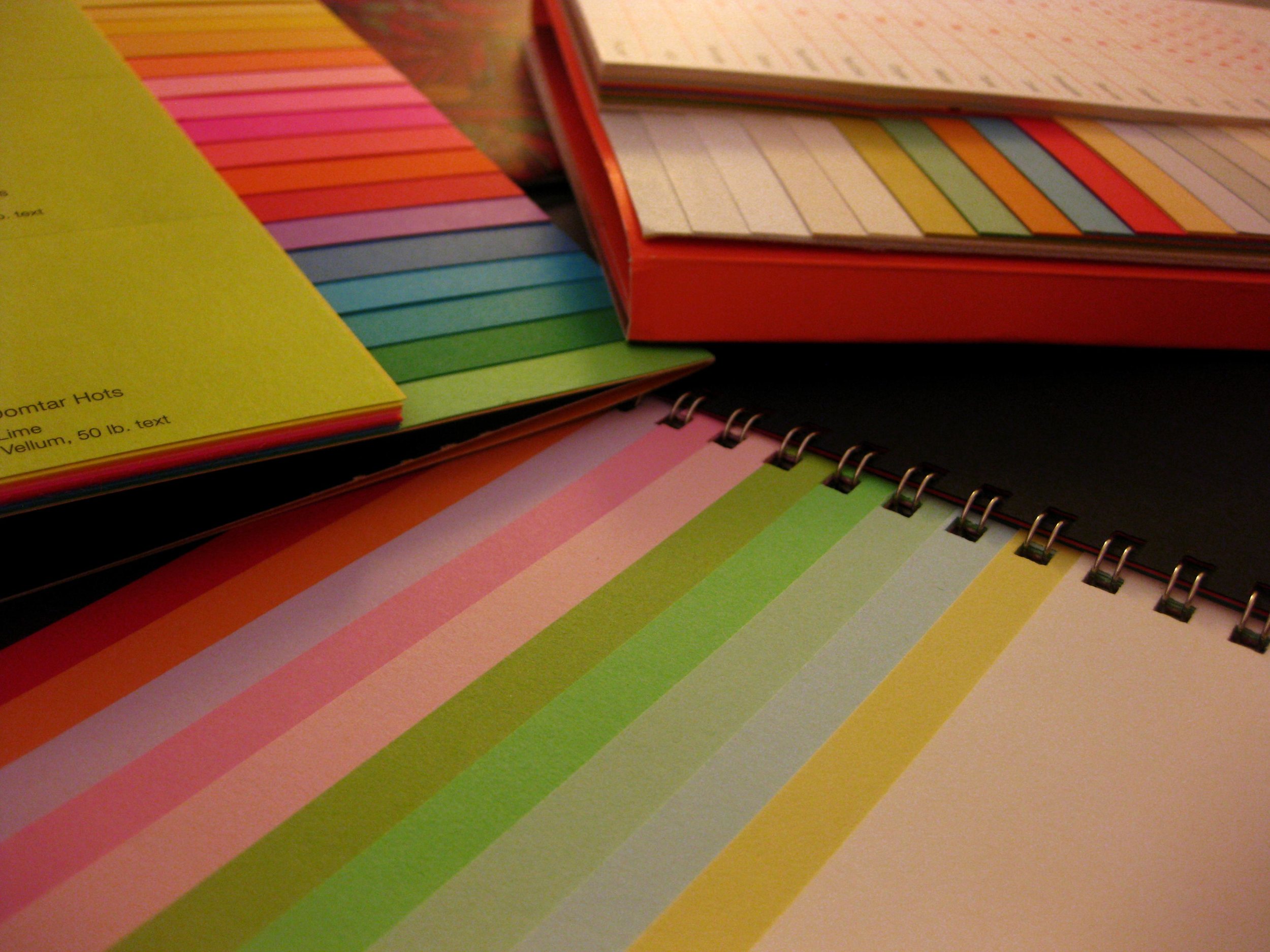
COLORS
 Signature colors are a great way to express your brand. Brand colors should be chosen for specific reasons. Queen Elizabeth, for example, chose colors of white and gold to represent her purity, and red and black to express her wealth (red and black dyes were very expensive in her time). Courtiers who wanted to identify with her went to great expense to wear the same colors.
In my last job, my organization operated an airport, a seaport, public marinas and public parks. So, the brand colors selected were light blue (air), green (land) and dark blue (sea) and were displayed in three wave-shaped bars indicating forward movement.
For myself I chose two shades of green, to reflect both the color most often associated with Irish, and the prominent color on the cover of my first novel. I added a third color of ocean blue for variety and balance. I wear the greens at every book festival, signing or speaking event, not as a uniform but via a scarf or a nice silk blouse so the message is not shouted but still effective. And, I use the colors prominently in my book displays.
 What colors should you choose? Here again I strongly advise working with a graphic designer who has experience with various media and how colors behave in each. Print colors do not look the same as screen colors, but designers can find the best options to give you greatest consistency across all media.
Think about the values you want to represent, and then take a look at a color chart to get some ideas.
http://www.pantone-colours.com
Color alone cannot be counted on to influence your readers’ behavior, because people tend to react to colors based on their own experiences, but it can play a role when it reflects the core values of your brand.
It’s the feeling, mood, and image that your brand creates that play a role in persuasion. Be sure to recognize that colors only come into play when they can be used to match a brand’s desired personality (i.e., the use of white to communicate Apple’s love of clean, simple design).
http://www.helpscout.net/blog/psychology-of-color/
I hope this series has helped you fill out your branding worksheet, or at least get a good start on it. I know it takes a bit of soul searching, but knowing your own brand sets you on a solid path for marketing yourself in a consistent and professional way.
Let me know how it works for you. I’m happy to answer questions and respond to your comments. Happy branding!
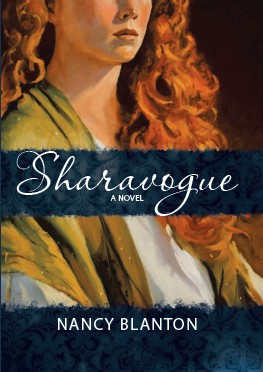 Sharavogue is an award-winning novel of 17th century Ireland and the West Indies. It is both historical fiction and fast-paced adventure. You can purchase Sharavogue at amazon.com, barnesandnoble.com, and most online booksellers. Visit my website at www.sharavogue.com for more information.
Follow this blog for research updates and announcements. I’ll be posting a new series soon about my on-the-ground research in Ireland for my upcoming book, a prequel to Sharavogue.


